
A Framework for EDA
Scenario 1: A product owner wants you to develop a particular machine learning use case. Your first step is to explore the data, however there are GB’s or TB’s worth of data stored in disparate tables.
Scenario 2: You are tasked to rebuild an existing Machine Learning (ML) model that has been performing poorly.
Whether you are building an ML solution from scratch or augmenting an existing one – like the aforementioned scenarios – it is vital to start from Exploratory Data Analysis (EDA), which is basically a buzzword for understanding the data.
In the past, I have made the rookie move of ignoring EDA and diving straight into the fancy ML algorithms, but this is a costly mistake. In one instance, one of the features has many anomalies that skewed the dataset and ultimately resulted in a flawed ML model. EDA saves you all this trouble by identifying these potential issues at the beginning.
Initial Exploration
Always start small. If you have a large dataset, take a subset to perform EDA. For this analysis, I will use a Telco Churn dataset, which consists of customer attributes and whether they have terminated their connections with a Telco company – aka churn. Let’s start by peeking at the data …
df.head()| customerID | gender | SeniorCitizen | Partner | Dependents | tenure | PhoneService | MultipleLines | InternetService | OnlineSecurity | OnlineBackup | DeviceProtection | TechSupport | StreamingTV | StreamingMovies | Contract | PaperlessBilling | PaymentMethod | MonthlyCharges | TotalCharges | Churn | |
|---|---|---|---|---|---|---|---|---|---|---|---|---|---|---|---|---|---|---|---|---|---|
| 0 | 7590-VHVEG | Female | 0 | Yes | No | 1 | No | No phone service | DSL | No | Yes | No | No | No | No | Month-to-month | Yes | Electronic check | 29.85 | 29.85 | No |
| 1 | 5575-GNVDE | Male | 0 | No | No | 34 | Yes | No | DSL | Yes | No | Yes | No | No | No | One year | No | Mailed check | 56.95 | 1889.5 | No |
| 2 | 3668-QPYBK | Male | 0 | No | No | 2 | Yes | No | DSL | Yes | Yes | No | No | No | No | Month-to-month | Yes | Mailed check | 53.85 | 108.15 | Yes |
| 3 | 7795-CFOCW | Male | 0 | No | No | 45 | No | No phone service | DSL | Yes | No | Yes | Yes | No | No | One year | No | Bank transfer (automatic) | 42.30 | 1840.75 | No |
| 4 | 9237-HQITU | Female | 0 | No | No | 2 | Yes | No | Fiber optic | No | No | No | No | No | No | Month-to-month | Yes | Electronic check | 70.70 | 151.65 | Yes |
… and understanding the data types of each column.
df.info(show_counts = True)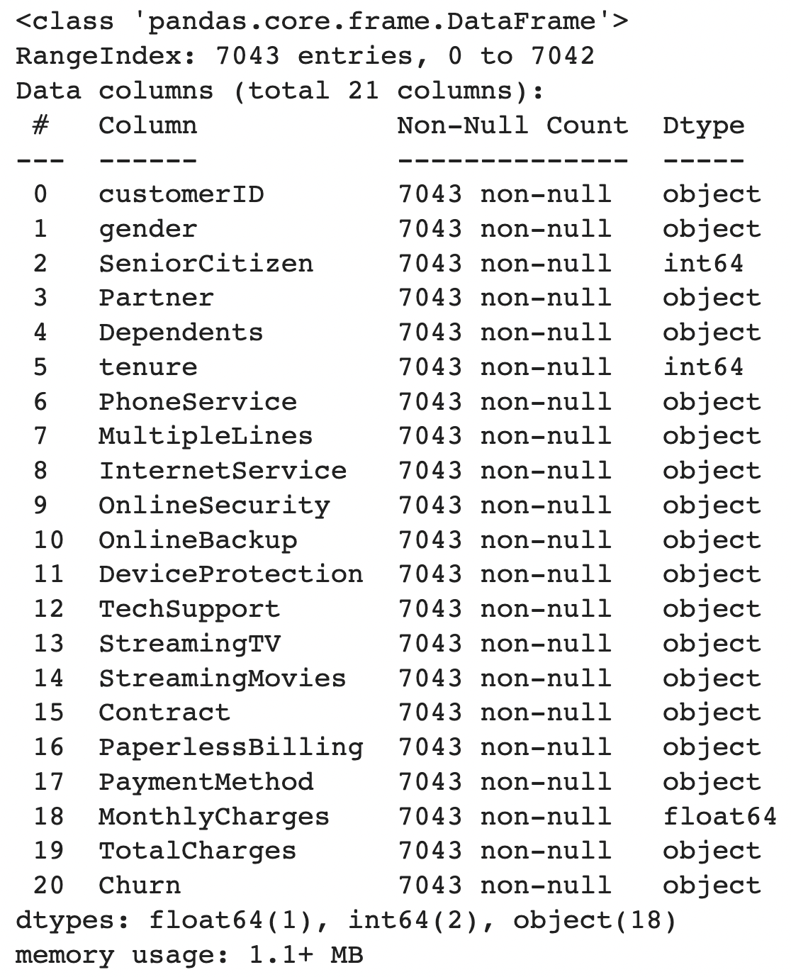
Key findings from our initial exploration:
CustomerIDis the ID column, that can be dropped for EDA purposesChurnis the target label- Many features have an
objectdatatype TotalChargesshould be numeric – suspect there might be astringorNULLvalues that cause this feature to be anobjectdatatype
Datatype Conversion
For features of object type, it’s best practice to convert them to numerical types such as float64and int64 wherever possible for two reasons (1) Certain EDA commands such as df.describe() would not work with object types (2) pandas process numerical data types faster, which is useful when your dataset is massive.
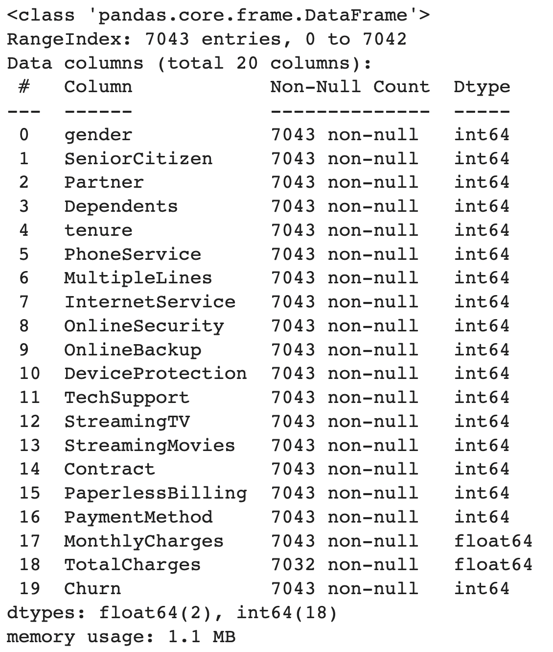
Based on the info above, we can see that features with object datatypes are encoded into numerical datatypes. Next, let’s understand the basic statistics of our dataset.
df.describe().apply(lambda s: s.apply('{0:.2f}'.format))| gender | SeniorCitizen | Partner | Dependents | tenure | PhoneService | MultipleLines | InternetService | OnlineSecurity | OnlineBackup | DeviceProtection | TechSupport | StreamingTV | StreamingMovies | Contract | PaperlessBilling | PaymentMethod | MonthlyCharges | TotalCharges | Churn | |
|---|---|---|---|---|---|---|---|---|---|---|---|---|---|---|---|---|---|---|---|---|
| count | 7043.00 | 7043.00 | 7043.00 | 7043.00 | 7043.00 | 7043.00 | 7043.00 | 7043.00 | 7043.00 | 7043.00 | 7043.00 | 7043.00 | 7043.00 | 7043.00 | 7043.00 | 7043.00 | 7043.00 | 7043.00 | 7032.00 | 7043.00 |
| mean | 0.50 | 0.16 | 0.48 | 0.30 | 32.37 | 0.90 | 0.94 | 0.87 | 0.79 | 0.91 | 0.90 | 0.80 | 0.99 | 0.99 | 0.69 | 0.59 | 1.57 | 64.76 | 2283.30 | 0.27 |
| std | 0.50 | 0.37 | 0.50 | 0.46 | 24.56 | 0.30 | 0.95 | 0.74 | 0.86 | 0.88 | 0.88 | 0.86 | 0.89 | 0.89 | 0.83 | 0.49 | 1.07 | 30.09 | 2266.77 | 0.44 |
| min | 0.00 | 0.00 | 0.00 | 0.00 | 0.00 | 0.00 | 0.00 | 0.00 | 0.00 | 0.00 | 0.00 | 0.00 | 0.00 | 0.00 | 0.00 | 0.00 | 0.00 | 18.25 | 18.80 | 0.00 |
| 25% | 0.00 | 0.00 | 0.00 | 0.00 | 9.00 | 1.00 | 0.00 | 0.00 | 0.00 | 0.00 | 0.00 | 0.00 | 0.00 | 0.00 | 0.00 | 0.00 | 1.00 | 35.50 | 401.45 | 0.00 |
| 50% | 1.00 | 0.00 | 0.00 | 0.00 | 29.00 | 1.00 | 1.00 | 1.00 | 1.00 | 1.00 | 1.00 | 1.00 | 1.00 | 1.00 | 0.00 | 1.00 | 2.00 | 70.35 | 1397.47 | 0.00 |
| 75% | 1.00 | 0.00 | 1.00 | 1.00 | 55.00 | 1.00 | 2.00 | 1.00 | 2.00 | 2.00 | 2.00 | 2.00 | 2.00 | 2.00 | 1.00 | 1.00 | 2.00 | 89.85 | 3794.74 | 1.00 |
| max | 1.00 | 1.00 | 1.00 | 1.00 | 72.00 | 1.00 | 2.00 | 2.00 | 2.00 | 2.00 | 2.00 | 2.00 | 2.00 | 2.00 | 2.00 | 1.00 | 3.00 | 118.75 | 8684.80 | 1.00 |
A quick glance tells us that for numerical features such as TotalCharges, the 75th quartile is not vastly different from the max value, indicating that this feature should contain little to no outliers. Also, the max value for tenure is 72, which makes logical sense.
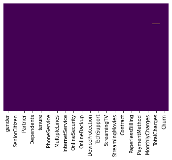
Missing Values
Calculating the percentage of missing values provides us with more clues in determining the appropriate treatment. For instance, if 90% of values in a single feature are missing, it’s best to avoid using it unless there’s a good reason not to, in which we can impute it.
def missing_values_table(df):

    '''This function calculates the percentage of missing values per column in the given dataframe'''
    mis_val = df.isnull().sum()
    mis_val_percent = 100 * df.isnull().sum() / len(df)
    mis_val_table = pd.concat([mis_val, mis_val_percent], axis=1)
    mis_val_table_ren_columns = mis_val_table.rename(
    columns = {0 : 'Missing Values', 1 : '% of Total Values'})
    mis_val_table_ren_columns = mis_val_table_ren_columns[
        mis_val_table_ren_columns.iloc[:,1] != 0].sort_values(
    '% of Total Values', ascending=False).round(1)
    print (f"Your selected dataframe has {str(df.shape[1])} columns.")
    print(f"There are {str(mis_val_table_ren_columns.shape[0])} columns that have missing values.")

    return mis_val_table_ren_columns
If you’re more of a visual person, you can also run sns.heatmap(df.isnull(),cbar=False,yticklabels=False,cmap = 'viridis') which generates the following image.
Checking for Outliers
Let’s venture into heavy statistics territory to identify outliers. A box plot is the best method to visualise outliers. According to this blog, an outlier is defined as a datapoint that lies outside the (Q1 - 1.5*IQR, Q3 + 1.5*IQR) range.
def outlier_boxplot(df, numerical_cols):
    fig, axs = plt.subplots(len(numerical_cols), figsize=(8, 8))

    for i, col in enumerate(numerical_cols):
        sns.set_style('whitegrid')
        sns.boxplot(y=df[col],color='green',orient='v', ax = axs[i])
        plt.tight_layout()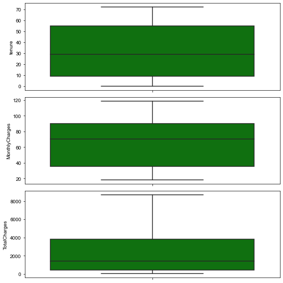
If there are outliers, and the outlier in question is:
- A measurement error or data entry error, correct the error if possible. If you cannot fix it, remove that observation because you know it’s incorrect.
- Not a part of the population you are studying (i.e., unusual properties or conditions), you can legitimately remove the outlier.
- A natural part of the population you are studying, you should not remove it.
Correlation Matrix
A correlation matrix is highly recommended to display the relationships between the features.
k = len(df.columns) #number of variables for heatmap
cols = df.corr().nlargest(k, 'Churn')['Churn'].index
cm = df[cols].corr()
plt.figure(figsize=(14,12))
sns.heatmap(cm, annot=True, cmap = 'viridis')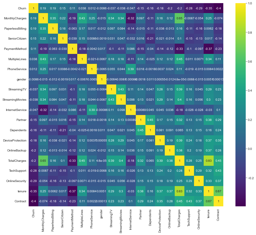
From the correlation matrix above, we can see:
Churn– the target label – is influenced little by features such asgender, andPhoneService. These two features could potentially be removed.Tenurehas a strong correlation withTotalCharges, which makes sense because the longer a customer’s tenure, the greater the amount that is paid to the telco company. Consider choosing either one of them.
Univariate Analysis
Univariate analysis focuses on one feature, enabling us to understand it, and its relationship with the target label.
Numerical Features vs Numerical Labels
For regression problems, the easiest way to understand a feature is to use a Scatterplot – this is not covered in this blog as the churn dataset has binary labels instead of continuous.
Numerical Features vs Categorical Labels
Histograms are one of my favourite visualisations as I could bin the numerical data into buckets.
def uni_histogram(df, feature, target):
    fig, ax = plt.subplots()

    ax.hist(df[df[target]==1][feature], bins=15, alpha=0.5, color="blue", label="Churn")
    ax.hist(df[df[target]==0][feature], bins=15, alpha=0.5, color="green", label="No Churn")

    ax.set_xlabel(feature)
    ax.set_ylabel(f"Count of {target}")

    fig.suptitle(f"{feature} vs. {target}")

    ax.legend();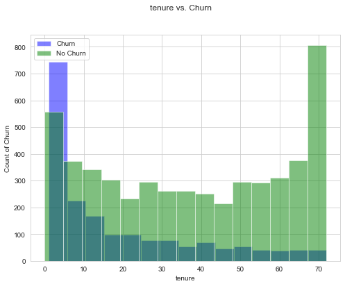
Kernel Distribution Estimate (KDE) Plots are another great option for visualising the distribution of a dataset is analogous to a histogram.
def uni_kde(df, feature, target, classes=None):
    fig, ax = plt.subplots()

    sns.kdeplot(df[df[target]==1][feature], shade=True, color="blue", label="Churn", ax=ax)
    sns.kdeplot(df[df[target]==0][feature], shade=True, color="green", label="No Churn", ax=ax)

    ax.legend(labels=classes)
    ax.set_xlabel(feature)
    ax.set_ylabel(f"Count of {target}")

    fig.suptitle(f"{feature} vs. {target}");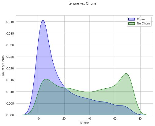
Categorical Features vs Categorical Labels
Grouped Bar Chart For categorical features, it’s good to plot the count of each class against the target labels.
from matplotlib.patches import Patch

def uni_bar_chart(df, feature, target, x_classes):
    fig, ax = plt.subplots(figsize=(8, 6))

    sns.countplot(x=feature, hue=target, data=df,
                palette={0:"green",1:"blue" }, ax=ax)

    ax.set_xticklabels(x_classes, rotation=45)
    ax.set_xlabel(feature)

    color_patches = [
        Patch(facecolor="blue", label="Churn"),
        Patch(facecolor="green", label="No Churn")
    ]
    ax.legend(handles=color_patches)

    fig.suptitle(f"{feature} vs. {target}");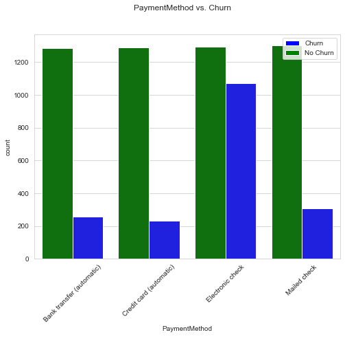
Depending on which is more intuitive, you can also invert the axes of the grouped bar chart.
def uni_bar_chart_inverse(df, feature, target, classes):
    fig, ax = plt.subplots(figsize=(8, 6))

    sns.countplot(x=target, hue=feature, data=df,
                  palette={0:"yellow", 1:"orange", 2:"red", 3:"purple"}, ax=ax)

    ax.set_xlabel(feature)
    ax.legend(labels=classes)
    ax.set_xlabel(target)
    fig.suptitle(f"{target} vs. {feature}");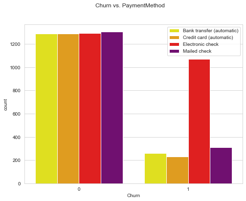
Stacked bar chart is another useful tool to have. As opposed to grouped bar chart which displays absolute values, stacked bar chart shows proportion, which totals to 1.
def uni_stacked_bar_chart(df, feature, target, x_classes=None):

    counts_df = df.groupby([feature, target])[target].count().unstack()
    survived_percents_df = counts_df.T.div(counts_df.T.sum()).T

    fig, ax = plt.subplots(figsize=(8, 6))

    survived_percents_df.plot(kind="bar", stacked=True, color=["green", "blue"], ax=ax)

    ax.set_xlabel(feature)
    ax.set_xticklabels(x_classes, rotation=45)
    ax.set_ylabel("Proportion")

    color_patches = [
        Patch(facecolor="blue", label="Churn"),
        Patch(facecolor="green", label="No Churn")
    ]
    ax.legend(handles=color_patches)

    fig.suptitle(f"{feature} vs. {target}");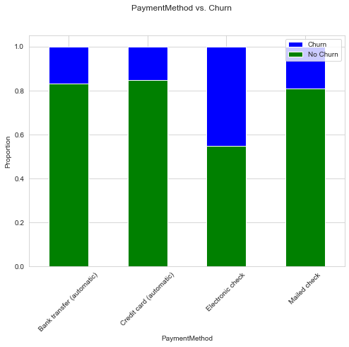
Bi-variate or Multi-variate Analysis
Bi-variate or multi-variate analysis investigates two or more features, and scatterplots are an excellent starting point. If you are using Python’s matplotlib or seaborn package, keep in mind that once you have more than 100k data points, it becomes increasingly slow (You should not need 100K data points in a scatterplot anyways, as it is going to be messy).
def multi_scatterplot(df, feature1, feature2, target):
    fig, ax = plt.subplots(figsize=(10, 8))
    sns.scatterplot(data=df, x=feature1, y=feature2, hue=target, ax=ax, palette={0:"green",1:"blue" })

    color_patches = [
        Patch(facecolor="blue", label="Churn"),
        Patch(facecolor="green", label="No Churn")
    ]
    ax.legend(handles=color_patches)

    plt.show()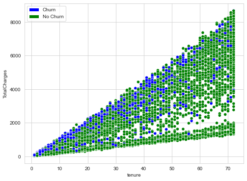
A shortcut method is to use a pair plot!
sns.pairplot(df[["tenure","TotalCharges", "Churn"]], hue="Churn")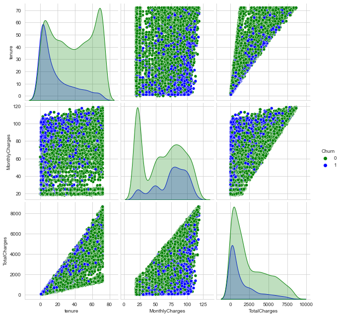
| Feature Type | Univariate Analysis | Multivariate Analysis |
|---|---|---|
| Numerical Features vs Numerical Labels | Scatterplot* | - |
| Numerical Features vs Categorical Labels | Histogram, KDE Plots | Scatterplot, Pair Plot |
| Categorical Features vs Categorical Labels | Grouped Bar Chart, Stacked Bar Chart | Balloon Plot* |
* Not covered in this blog
You can also refer to the full notebook for reference.
Final Thoughts
- Be creative – the steps above are not exhaustive; there might be better visualisations and statistics tools.
- The process of EDA should not take too long – remember it’s just to help you understand the data better. If you think you may be experiencing “paralysis by analysis”, take a deep breath, step back, and ask what the purpose of this EDA step is.
Comments